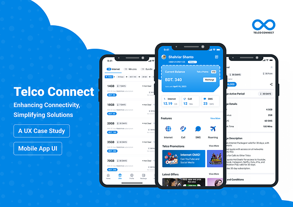
TelcoConnect is a mobile self-service telecom application designed to help users manage their balance, data plans, call/SMS bundles, promotions, and gifting with speed and confidence.
Unlike many telecom apps that attempt to function as lifestyle super-apps, TelcoConnect was intentionally designed as a task-first utility product—prioritizing clarity, accessibility, and low cognitive load for high-frequency telecom actions.
This case study documents the design rationale, system decisions, and UX trade-offs, with direct comparison to existing telecom apps such as MyGP and My Robi.
Problem Context
Telecom users frequently interact with apps for urgent, transactional tasks:
Checking remaining balance or data
Purchasing a package before expiry
Sending a bundle as a gift
Activating received services
However, many existing telecom apps suffer from:
Overloaded dashboards mixing utility with lifestyle content
Dense package listings with weak comparison cues
Promotional content interrupting task flow
Limited accessibility consideration for readability and clarity
These issues increase:
Decision fatigue
Purchase abandonment
Reliance on customer support
Competitive Landscape Insight
(MyGP & My Robi)
Observed Market Patterns
Dimension
MyGP / My Robi
Impact on UX
Product Strategy
Utility + lifestyle ecosystem
Increased complexity
Dashboard Content
Telecom + offers + entertainment
Visual & cognitive load
Package Discovery
Feature-rich but dense
Harder comparison
Promotions
Embedded in core flows
Task interruption
Accessibility
Moderate
Not optimized for all users
Key Insight: While MyGP and My Robi succeed as engagement platforms, their mixed-purpose interfaces often compromise speed, clarity, and task confidence—especially for essential telecom actions.
Design Goal
Design a telecom app that:
Optimizes speed and confidence for core tasks
Reduces decision friction in package selection
Makes gifting safe, reversible, and understandable
Remains scalable without visual or structural clutter
Works for users with varying digital literacy levels
UX Strategy
1. Task-First Information Architecture
Instead of mixing content types:
TelcoConnect separates core telecom tasks from secondary services
Bottom navigation reflects user intent, not business promotions
Each screen answers one primary question only
Result: Faster orientation and reduced mental overhead.
2. Progressive Disclosure Over Density
Compared to MyGP / My Robi’s dense listings:
TelcoConnect surfaces only essential attributes first (Price, Data/Minutes, Validity)
Secondary details appear on demand
Terms & conditions are collapsible—not hidden
Result: Users compare plans visually instead of reading blocks of text.
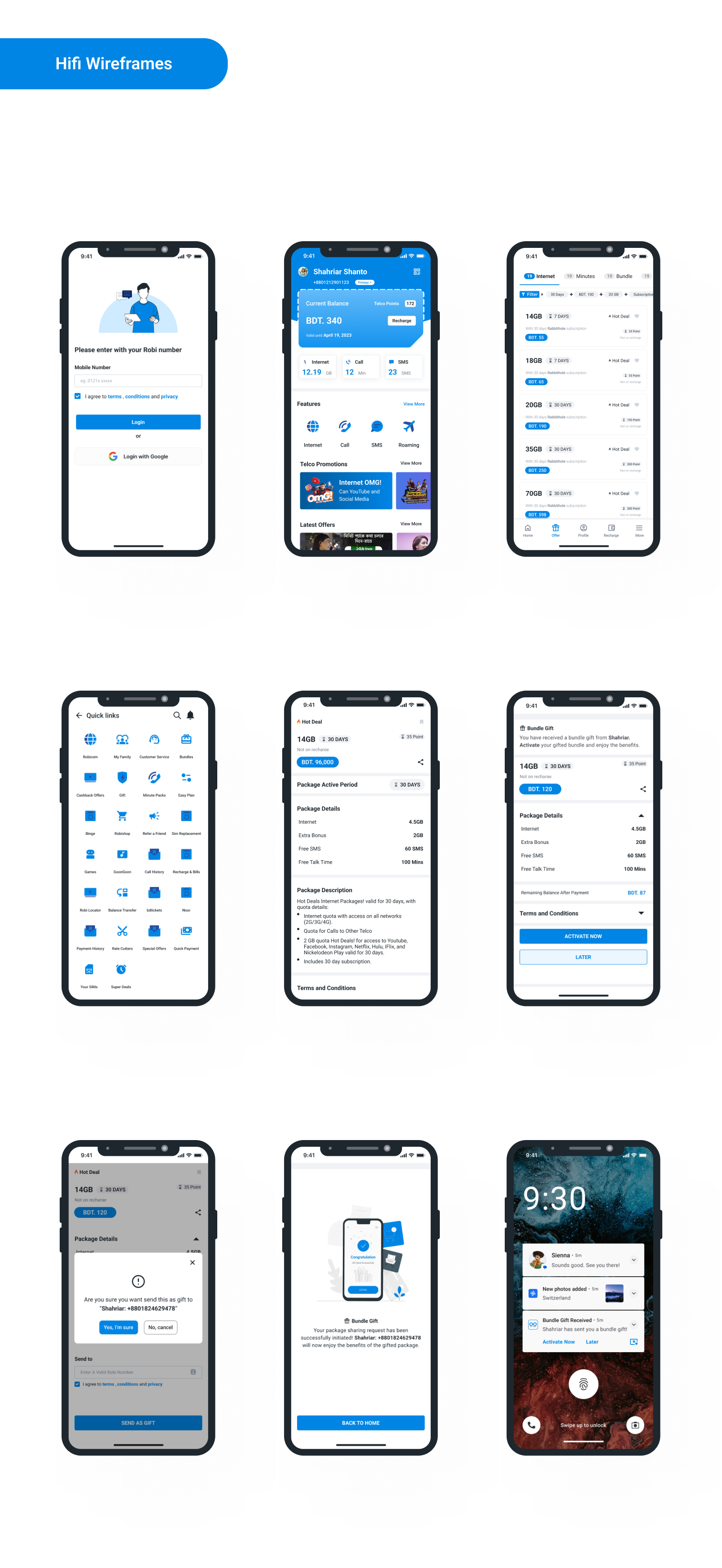
3. Safe & Transparent Gifting Flow
Gifting is a high-risk action in telecom apps.
Design decisions:
Explicit “Send as Gift” action (not hidden)
Clear recipient confirmation step
Reassurance copy before irreversible actions
Dedicated success state with next-step clarity
Difference vs Market: Where other apps rely on dense forms, TelcoConnect focuses on error prevention and confidence building.
4. Accessibility-Driven UI Decisions
Large, readable typography for prices and data values
High-contrast CTAs for transactional actions
Touch-friendly spacing for low-precision input
Avoidance of icon-only meaning in critical steps
Strategic Choice: Accessibility is treated as a core usability requirement, not an enhancement.
Core User Flows
Authentication
Mobile number → OTP
Clear error handling and resend states
Minimal copy to reduce friction
Package Discovery
Category-based tabs (Internet / Minutes / Bundle)
Filters by price, validity, and category
Visual priority on value, not promotion
Purchase
Select package
Review essentials
Confirm purchase
Clear success feedback
Gifting
Select package
Choose gift option
Confirm recipient
Explicit confirmation
Success + reassurance
Gift Activation (Receiver)
Notification-driven entry
Clear “Activate Now” vs “Later” choice
No forced activation
Visual Design Philosophy
Unlike visually busy telecom apps:
Decorative elements are minimized in transactional screens
Cards are used to group meaning, not decoration
Color reinforces hierarchy, not branding noise
Familiar mobile patterns reduce learning time
Outcome: A calm, predictable interface that respects user urgency.
Comparison Summary
Aspect
TelcoConnect
MyGP / My Robi
UX Focus
Task efficiency
Engagement ecosystem
Cognitive Load
Low
Medium–High
Package Comparison
Optimized
Dense
Gifting Flow
Explicit & safe
Functional but complex
Accessibility
Prioritized
Secondary
Scalability
System-driven
Feature-driven
Outcome & Impact
Reduced friction in package selection
Faster task completion for frequent actions
Improved confidence in gifting and activation
Scalable UX foundation for future telecom features
Production-ready system aligned with real user behavior
What This Case Study Demonstrates
Strategic UX thinking beyond UI
Competitive product analysis
Accessibility-first decision making
Transaction-focused mobile UX
Real-world telecom product design maturity
Reflection
This project reinforced a key principle:
In telecom UX, speed and clarity matter more than feature count.
By intentionally designing less, TelcoConnect delivers more confidence, usability, and trust—especially compared to ecosystem-heavy telecom apps.